
14 YouTube Thumbnail Ideas That Get Clicks (With Examples)
Fourteen thumbnail layouts that work, matched to the kinds of videos they suit: reaction, versus, before and after, list, cinematic, podcast and more. Plus a five-step way to make one and the five checks every thumbnail should pass.
The thumbnail ideas that work best are simple: one face or object, one clear contrast, and two to four words that add to the title. Below are fourteen layouts that follow that rule, each matched to the kind of video it suits, then a five-step way to make one and five checks to run before you upload.
Pick the idea that matches your video's promise, not the one that looks best on its own. A thumbnail that over-promises gets the click and loses the viewer.
14 YouTube thumbnail ideas by type of video
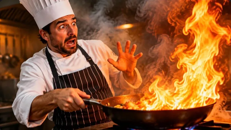
1. Reaction + object
Your face showing one strong emotion next to the thing you are reacting to. The emotion tells viewers how to feel; the object tells them what the video is about. Best for: reviews, unboxings, entertainment, cooking.
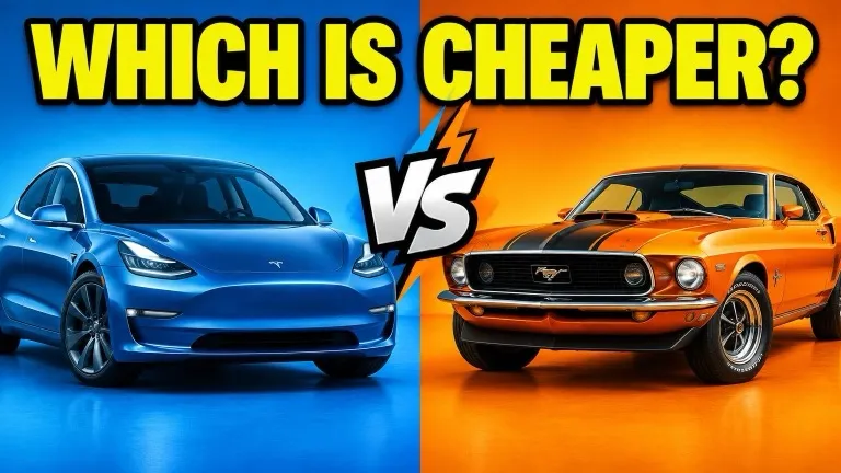
2. Versus
Two options split down the middle, each with its own color. Add a "VS" or a question mark in the gap. Best for: comparisons, debates, "which is better" videos.
3. Before / after
The same subject twice, left and right, with an arrow between them. The bigger the visible change, the stronger the click. Best for: transformations, renovations, fitness, editing results.
4. Tech tutorial
The tool's interface or logo, enlarged, with one highlighted element and a short outcome ("SAVE 2 HOURS"). Clean background, sharp edges. Best for: software, how-tos, settings walkthroughs.
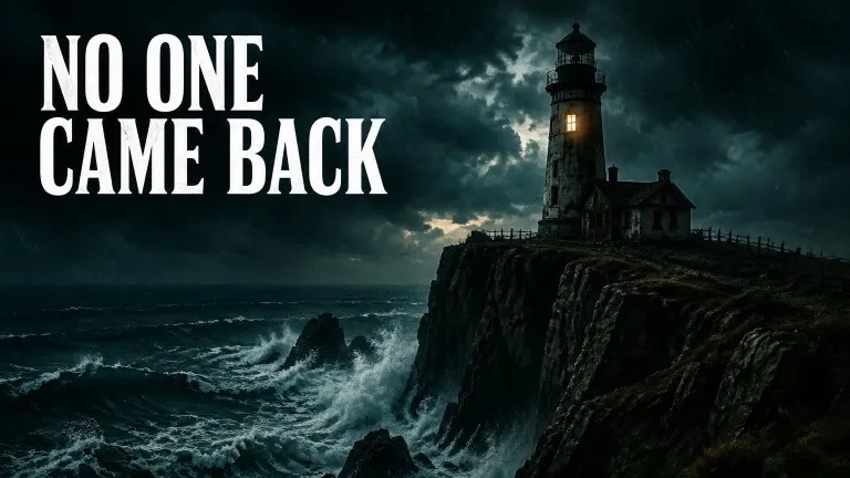
5. Cinematic
A dark, moody frame with one source of light and a single subject. Little or no text. Best for: history, true crime, video essays, documentaries.
6. Minimal bold
A flat background color, three words in heavy type, and maybe one small element. It stands out precisely because the feed around it is busy. Best for: commentary, business, opinion videos.
7. Story moment
The single most dramatic frame of the story, slightly before the outcome: the jump, the reveal, the moment something goes wrong. Best for: challenges, narrative vlogs, experiments.
8. List / ranking
A big number and the top item, or a tier row with one entry circled. The number promises a clear structure. Best for: top-N videos, mistakes, tips, rankings.
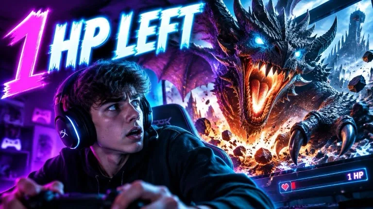
9. Gaming
The game's most recognizable character or moment, saturated colors, and your reaction cut out in a corner. Best for: let's plays, highlights, challenges, updates.
10. Money / finance
A clear number (a price, a return, a salary), a simple chart arrow and a serious face. Green and red do a lot of the work. Best for: personal finance, crypto, business breakdowns.

11. Vlog / travel
A wide, bright location shot with you small in the frame and a short place name or claim. The place is the star. Best for: travel, lifestyle, day-in-the-life videos.
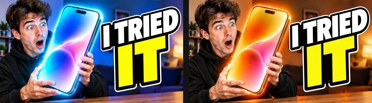
12. Hyper-saturated
Turned-up colors, a glow around the subject and very high stakes in a few words. Loud on purpose. Best for: big challenges, giveaways, extreme experiments.
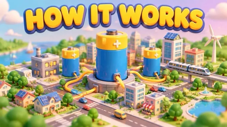
13. 3D / clay
A clean 3D or clay-style illustration of the idea, with no human face needed. Friendly and easy to read small. Best for: explainers, science, faceless channels.
14. Podcast / interview
Host and guest side by side, both looking toward the most surprising quote from the episode. The quote, cut to three or four words, is the hook. Best for: interviews, talk shows, podcast episodes.
Thumbnail examples
The image at the top of this page is a reaction thumbnail: one emotion, one object, no text needed. Here are three takes on a single video, "I turned one podcast into 30 viral shorts", previewed in a YouTube home feed:
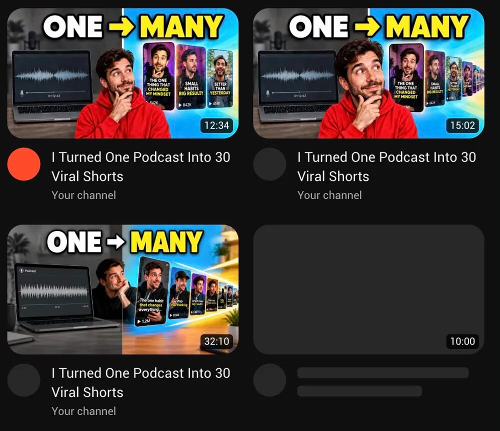
All three use the same idea (before / after: one long recording on the left, many short clips on the right) with different faces, colors and depth. Seeing them next to each other in a feed makes it obvious which ones read fastest at a small size. That is the comparison worth doing before you upload.
Edits work the same way. Describe one change, such as "switch every blue accent to bright orange", and only that part of the image changes:
How to make a YouTube thumbnail in five steps
- Write the title first. The thumbnail should add to the title, so you need to know what the title already says.
- Pick one idea from the list above. Match it to the video's promise and your niche.
- Get the main image. A frame from your video, a photo taken for the thumbnail, or an AI-generated scene. A face with a clear expression beats a neutral frame.
- Add two to four words. Heavy font, high contrast, placed away from the bottom-right corner where YouTube shows the video length.
- Export at 16:9. 1280 × 720 or larger, JPG or PNG. The exact limits are in our YouTube thumbnail size guide.
Five checks before you upload
| Check | Question to ask |
|---|---|
| Focal point | Is there exactly one thing the eye goes to first? |
| Contrast | Does it stand out against both the white and the dark YouTube theme? |
| Legibility | Can you read every word in under a second? |
| Phone size | Does it still work at about 170 pixels wide, the size of the sidebar? |
| Curiosity | Does it raise a question the title does not answer? |
The phone-size check catches most problems. Shrink the image on screen until it is the size of your thumb and look at it from arm's length. If the text or the face disappears, simplify.
Thumbnails for Shorts
Shorts now take custom thumbnails too, but they are vertical 9:16 and shown even smaller on shelves. Use one face or object and three words at most. The steps are in how to add a thumbnail to YouTube Shorts.
Short.now's AI thumbnail maker has each layout above as a style. Type your title, add a photo of your face, get up to four variants, then preview them in a YouTube feed and rate them on these five checks. Included in every paid plan.
Frequently Asked Questions
One clear focal point, strong contrast against the YouTube page, two to four words of text that are readable on a phone, and a reason to click that the title does not already give away. It should also match what happens early in the video.
For most personality-led channels, yes: a large face showing a clear emotion is the fastest thing to read at a small size. Faceless channels do well with a single bold object or a 3D illustration instead.
Two to four. The title sits right below the thumbnail, so the text should add something to it, not repeat it. If the words are unreadable at phone size, cut them.
No. Viewers read the image and the title together. Use the thumbnail for the emotion or the stakes, and the title for the topic. Repeating the same words wastes half the space.
Use YouTube's A/B test for titles and thumbnails in YouTube Studio on a computer. It compares up to three options on a long video by watch time. Shorts cannot be A/B tested.
Ready to stop editing and start publishing?
Short.now turns your long videos into scroll-stopping shorts automatically — in under 2 minutes.
Get started free 3 free videos every month · No credit card needed